


Marcos B. Renderos
The War on Fonts
As part of the Trump administration’s ongoing effort to dismantle DEIA policies, something unexpected has been swept up in the process: Calibri.
Leaving no serif unturned, the Secretary of State appears to be working overtime to root out anything even remotely associated with “wokeness”—all in the name of keeping us safe.
Marco Rubio, the U.S. Secretary of State, recently announced plans to eliminate the Calibri font, which has lived quietly inside Microsoft Word since 2007. In a memo titled “Return to Tradition: Times New Roman 14-Point Font Required for All Department Paper,” Rubio outlined a directive that critics say is the latest step in removing perceived traces of diversity initiatives across the federal government.
If you’re scratching your head wondering why, you’re not alone. The reasoning, it seems, is that Calibri has been deemed too “woke” for official documents. The solution? A firm return to the more “serious” Times New Roman, size 14.
Rubio further stated, “Typography shapes how official documents are perceived in terms of cohesion, professionalism, and formality,” in a cable sent to U.S. embassies and consulates worldwide.
So let’s take a closer look.
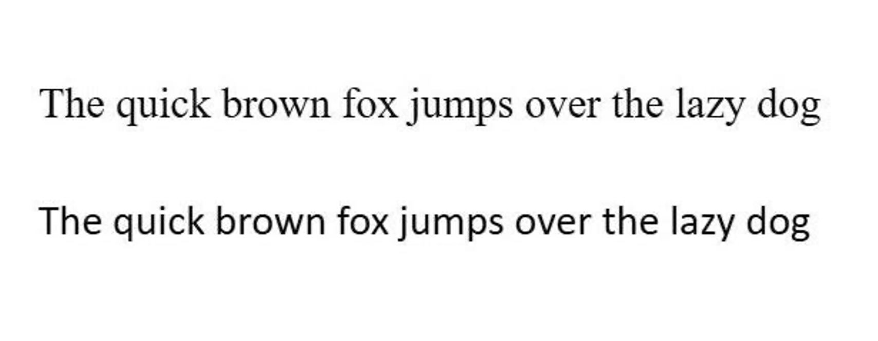
Times New Roman has long been seen as a classic, no-nonsense typeface. It carries the gravitas of a courtroom verdict or a college term paper written the night before it’s due. It feels official.
Calibri, on the other hand, features rounded edges and softer lines, making it easier to read—especially for those with visual difficulties.
The logic behind the ruling? According to Rubio, Calibri lacks “decorum.” But its real offense seems to be its readability, its softer design, and its accessibility—its lack of those sharp little serifs trying to prove a point. Naturally, that raises eyebrows.
Even Calibri’s creator finds the controversy puzzling:
“There are thousands of parameters that I use when designing a font to make it more readable. I’m not thinking of inclusion. In this case, it was just the assignment to make a very readable font for everybody.”
— Lucas de Groot
Times New Roman, by contrast, is practically mythologized—a font forged in the fires of academic deadlines, legal disclaimers, and strongly worded emails.
Still, Calibri will endure. It will continue to live on in résumés, school assignments, and everyday emails.
And somewhere, quietly, Comic Sans breathes a sigh of relief—grateful no one has noticed it