

Project Overview
This project focused on designing a website for a nonprofit organization dedicated to helping small businesses succeed in a competitive market. The primary goal of the website was to attract small business clients and volunteers, while encouraging users to engage with clear calls to action (CTAs).
Role: UX Designer
Tools: Figma
Project overview
This project focused on designing a website for a nonprofit organization dedicated to helping small businesses succeed in a competitive market. The primary goal of the website was to attract small business clients and volunteers, while encouraging users to engage with clear calls to action (CTAs).
Core Objectives
Limited and Unclear Information: The original website lacked sufficient content to clearly communicate the nonprofit’s mission, services, and value to users. Visitors were not given enough context to understand how the organization could support their needs, whether they were small business owners or potential volunteers. This lack of clarity created confusion and reduced trust, making it difficult for users to feel confident in engaging with the organization.
Poor Navigation Structure: The website’s navigation made it difficult for users to move between pages or find relevant information. There was little to no logical structure connecting content, which caused users to feel lost while browsing. Without intuitive navigation, users were unable to efficiently explore services, learn more about the organization, or locate important pages, leading to a frustrating user experience.
Absence of Clear Call-to-Action (CTA): One of the most critical issues was the lack of a clear call-to-action. Users were not guided toward any specific next step, such as signing up, volunteering, or contacting the organization. Without visible and compelling CTAs, the website failed to convert visitors into active users, resulting in missed opportunities for engagement and growth.
Low User Engagement and Conversions: Due to the combination of unclear content, poor navigation, and missing CTAs, the website struggled to engage users effectively. Visitors were more likely to leave the site without taking action, leading to low conversion rates. This directly impacted the nonprofit’s ability to attract volunteers, connect with small businesses, and grow its overall community presence.
Approach
To better understand the organization, I conducted stakeholder interviews with the project manager. I gathered insights on:
Services offered
Company history
Target audience
Business goals for the website
Using this information, I developed content strategy and messaging aligned with the organization’s mission.
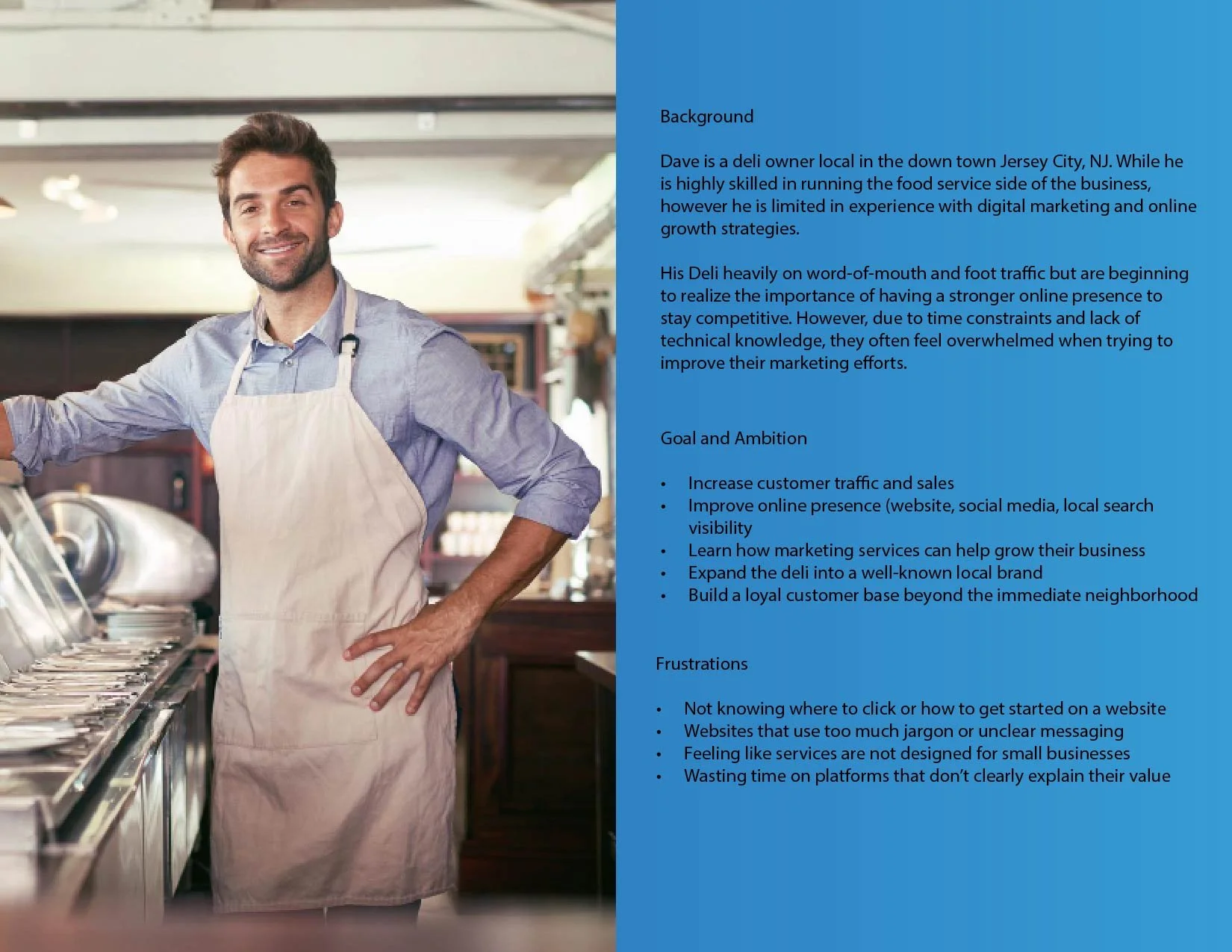
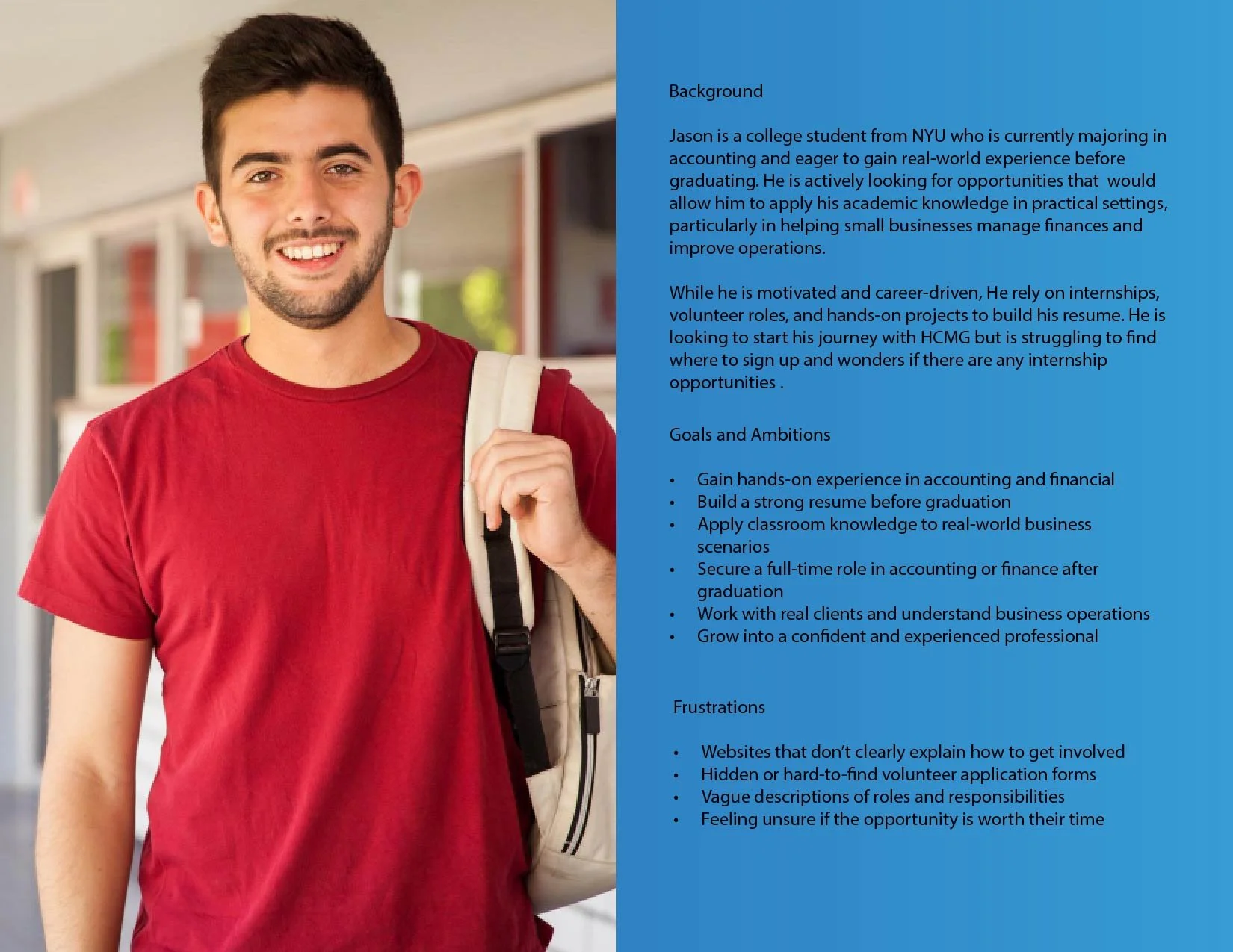
User Personas
Next I developed a user persona to better unstand our target audience. Creating these persona helps me focus on my design and feature set to meet the specific needs and perfernce of users like them.
Design Process
Wireframing & Prototyping
Using Figma, I created a mock website layout that:
Improved navigation structure
Introduced clear CTAs
Matched visuals with messaging
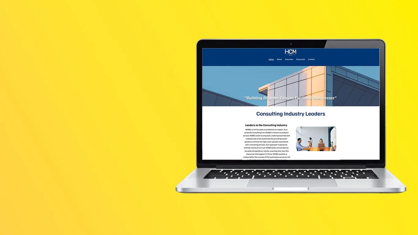
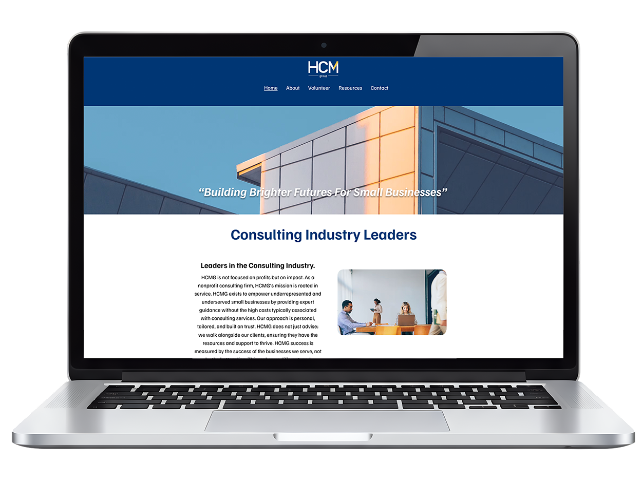
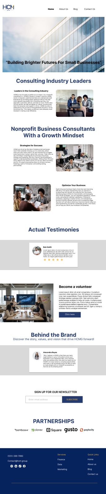
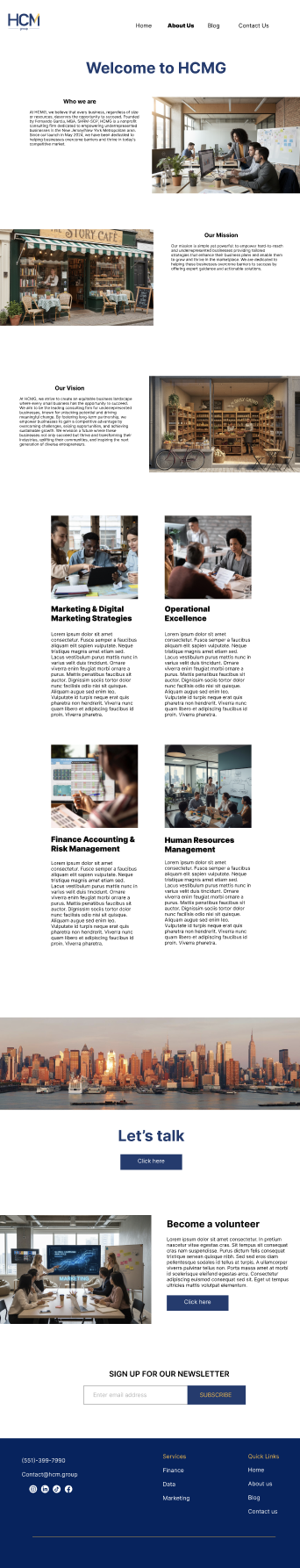
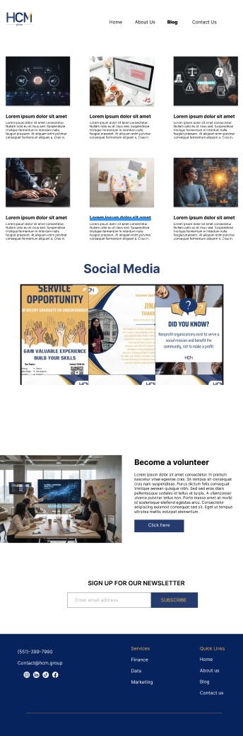
Final Design Solution
Home Page
Introduces the organization
Highlights value proposition
Encourages users to explore or take action
About Us Page
Provides deeper insight into the organization
Builds trust and credibility
Lists all services offered
Each service links to a dedicated page with detailed information
Resources Page
Features blogs and social media content
Encourages ongoing engagement
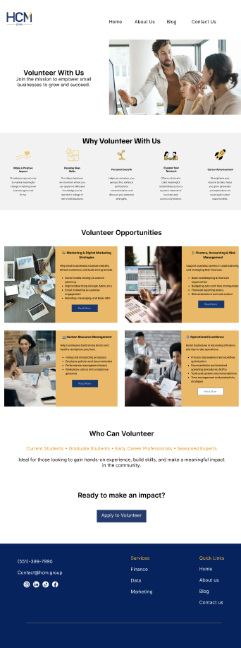
Volunteer Page
Targets students and early-career professionals
Includes clear sign-up opportunities
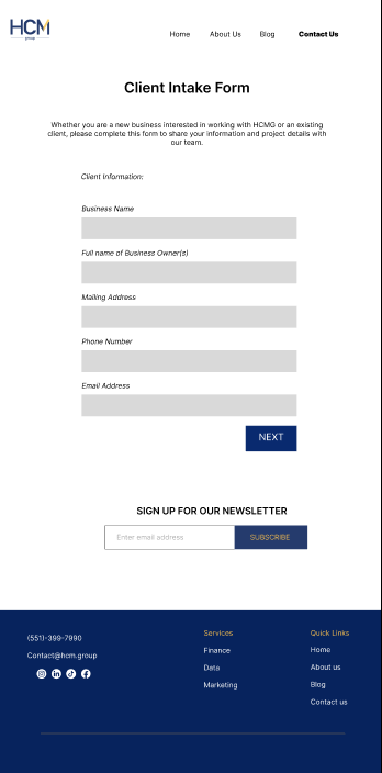
Call-to-Action Form
Allows potential clients to submit business information
Includes detailed questions to help the organization understand client needs
Results & Impact
Within the first three months after launch, the redesigned website showed clear improvements in engagement and user activity. Website traffic increased to over 400 visitors, indicating stronger visibility and interest in the organization’s services. Additionally, more than 10 student volunteers signed up at the start of the semester, demonstrating that the new structure and clearer pathways successfully attracted individuals seeking hands-on experience.
The redesign also led to increased interest from local businesses, with more inquiries coming through the site. Alongside this, the organization saw growth in newsletter subscribers, suggesting that users were more willing to stay connected and engage long-term. Overall, these results highlight how improved navigation, clearer messaging, and strong calls-to-action contributed to higher conversions and user engagement.